New Logo
Original Logo
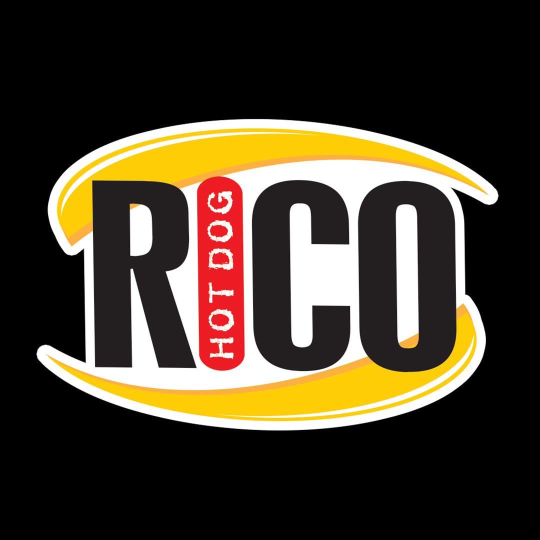
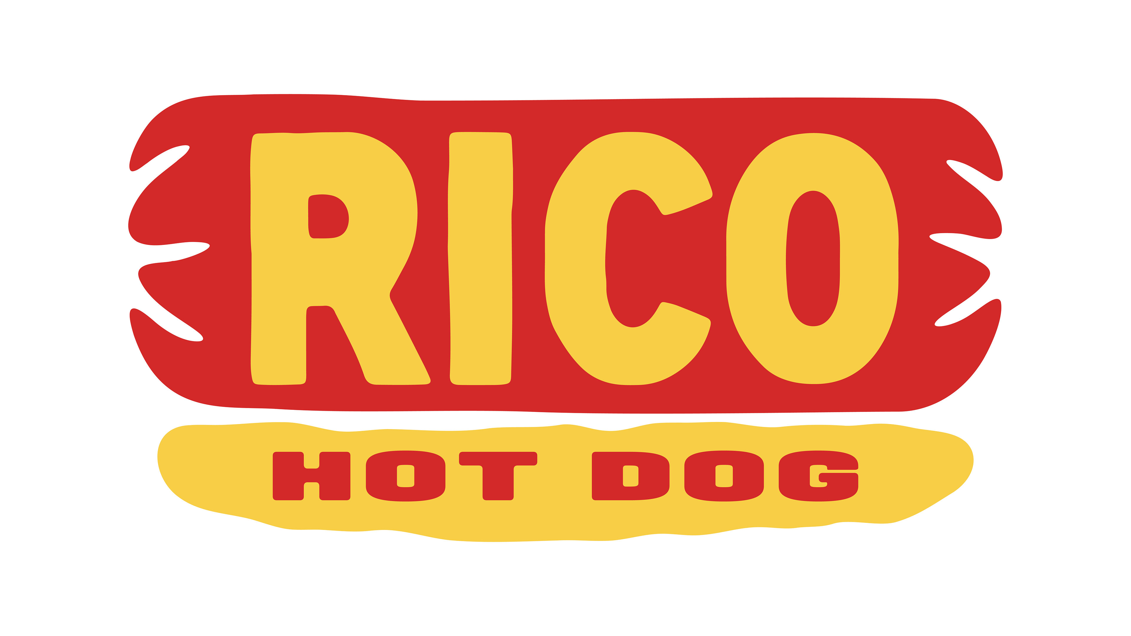
Last year, my girlfriend brought me all the way to the Dominican Republic to meet her grandmother and experience her culture. It was my first time leaving the United States, and it was such a beautiful experience that I would love to visit again. I got the chance to try new foods, talk with locals, walk through the colonial and capital cities, spend the day on a private beach, and see the bluest water imaginable. Although our trip was only four days, we ended up frequenting a small hot dog stand several times for a hot dog that, quite honestly, changed the way I will eat hot dogs forever. This stand, called Rico Hot Dog, was started on a street corner in Santo Domingo by Carlos Durán in 1988. Every time my girlfriend and I decide to make some for dinner, we have to make it Rico style, no exceptions. After recreating these hot dogs over the past year, I asked myself, 'Why not recreate the logo as well?' There were a couple of elements I wanted to retain from the brand's original logo (shown on the black background below) to maintain brand recognition and respect the Dominican culture, such as the brand's colors, boldness, and human touch. For the new logo, I thought, a hot dog is just a hot dog that's missing the Rico touch, so let's put Rico on a hot dog. The shapes and typefaces used in the logo have rough edges, showcasing the human touch and the spirit that is Rico Hot Dog. The new logo also fixes the problem of how it can stand out on different backgrounds. As the current logo is, it needs a white border to be presented on dark backgrounds, while the new logo can be more consistently presented. I had a lot of fun working on this project and creatively connecting with another culture. One reason I wanted to share this is to show how you can find inspiration to get creative anywhere, even in a hot dog.